Company
Product Features
Integrations
Grafana Integration
Highlight.io Changelog
Menu
Graphing

Creating / editing a graph
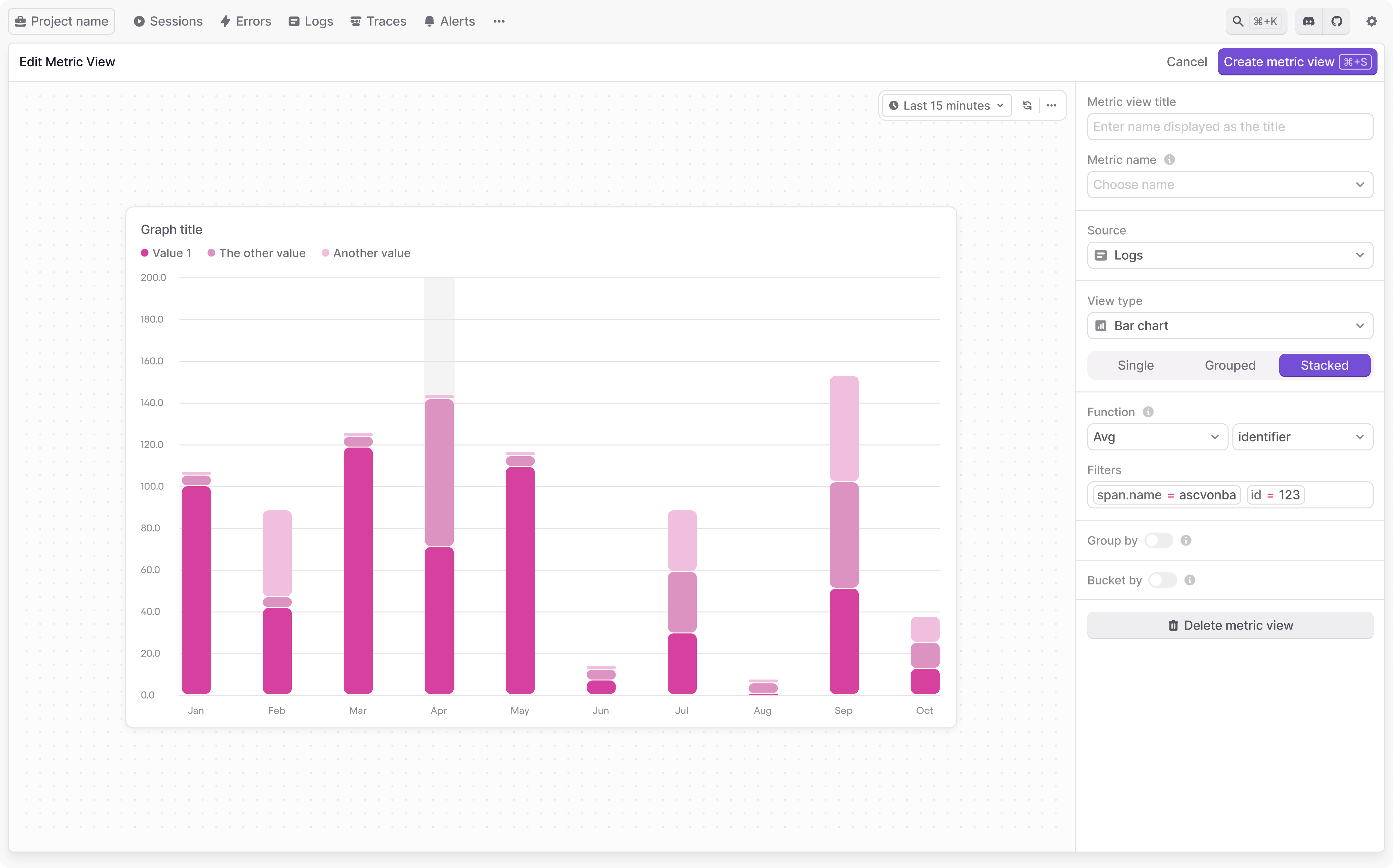
The graph editor allows you to choose how you query and aggregate data and how you display those results. There are many fields that can be configured to customize your graphs.
Graphing fields
Within the graph editor, the available fields are:
- Metric view title: this is a title shown at the top of each graph.
- Source: this is the resource being queried corresponding to each different highlight.io resource - one of "logs", "traces", "sessions", or "errors".
- View type: this is the general type of the graph shown - one of "Line chart", "Bar chart / histogram", "Table". Depending on your selection, "display" and "null" settings can help you fine-tune how this data is shown.
- Function: this is used to aggregate data points. Includes a variety of useful aggregations such as "Count", "Sum", "P90", "Min", "Max". If the function requires a field as input, any available numeric fields that appear in the chosen time range can be selected.
- Filters: this is the search query used to filter which resources are included. For more information on using search, check out our search docs.
- Group by: if enabled, you can choose a categorical field for grouping results. Data points are aggregated within groups. When grouping is enabled, you can limit the total number of groups shown. For example, you can graph only the top 10 most common groups by choosing "Limit 10 by Count", or the top 5 slowest with "Limit 5 by P90 duration".
- Bucket by: this can be configured to accomplish any of the following:
- Time series data: when set to Timestamp by default, data points are aggregated within consecutive time ranges.
- Histogram data: when set to a different numeric field, that field is shown on the X-axis, and equally divided into consecutive ranges. For example, if you want to examine the distribution of latency for a particular API endpoint, you can bucket by duration.
- Aggregate data: disabling bucketing allows you to aggregate data across your entire time range. This could be useful for displaying aggregate statistics, e.g. in tabular format.